
With the Inbox, our goal is for you to be able to manage any constituent communication as easily as you would your personal email while still leveraging the power of a full-featured CRM.
February's update is focused primarily on general correspondence and navigation. Here are just a few things to look forward to:
- Familiar email inbox interface that organizes conversations into personal and team inboxes
- Keyboard shortcuts to move through mail more efficiently
- Immediate access to conversation and person details when sorting mail
- Collapsible side sheets to access what you need when you need it
- Faster loading for lists in the Inbox and the Content library with the introduction of infinite scroll in place of paging
- Consistently placed navigation elements and action bars throughout the entire app
- More efficient "Create new" flows
- Greater responsiveness and dark mode!
Here are a few tips for navigating the Inbox:
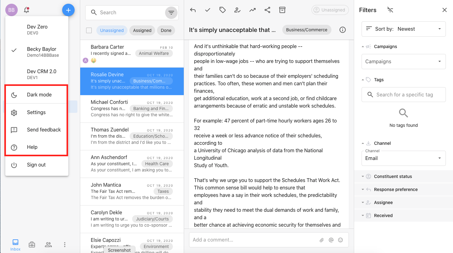
- Communications has been relabeled as Inbox. You can access other areas of the application such as Services, People, and Content library in the bottom left corner.
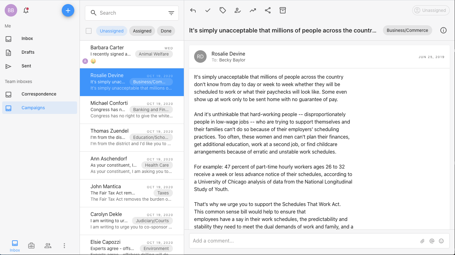
- Conversations are organized into inboxes on the left. There is a "Me" section that holds your personal inbox, drafts, and sent. Below "Me" are the "Team inboxes" for general correspondence and campaigns.
- Each inbox has pivots at the top of the list to indicate whether you're viewing unassigned, assigned, or done conversations. If you are viewing "Unassigned" and you assign a conversation to someone, it will move to the "Assigned" pivot. It will also show in that staff member's personal inbox.
- All the actions appear at the top of the conversation. If you're not sure what a button does, hover over it to see a tooltip.
- You can use your up and down arrows to move through the list of conversations. You can also use combinations such as shift + click or ctrl/cmd + click to select multiple conversations at a time.
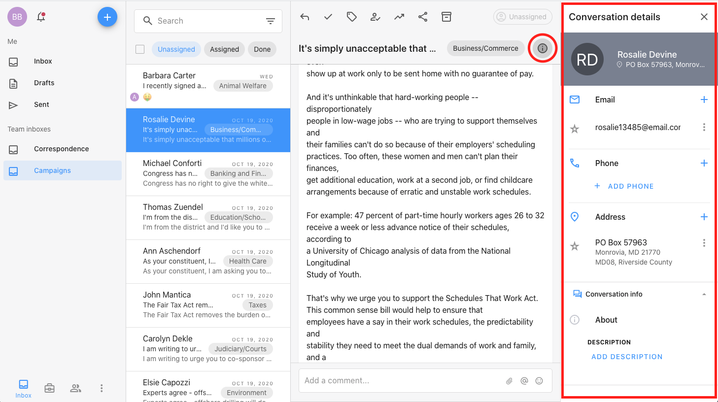
- Selecting a conversation automatically displays the full content of the conversation on the right. Click the small "i" in the top right corner to view more information about the conversation. This side sheet is expandable and collapsible so you can view the information you need when you need it and get it out of your way when you don't.
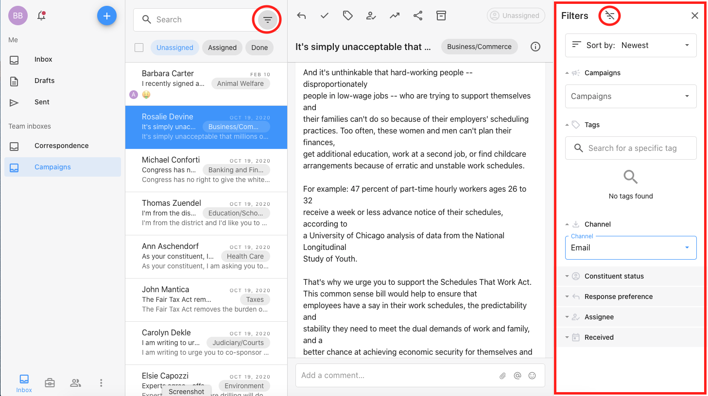
- Notifications and filters also appear on the right in sidesheets. Access your notifications by clicking the bell on the top left. Display filter options by clicking the filter icon in the search bar. To clear filters after you're done, click the filter icon with the slash through it and then close the panel using the "X" in the top right.
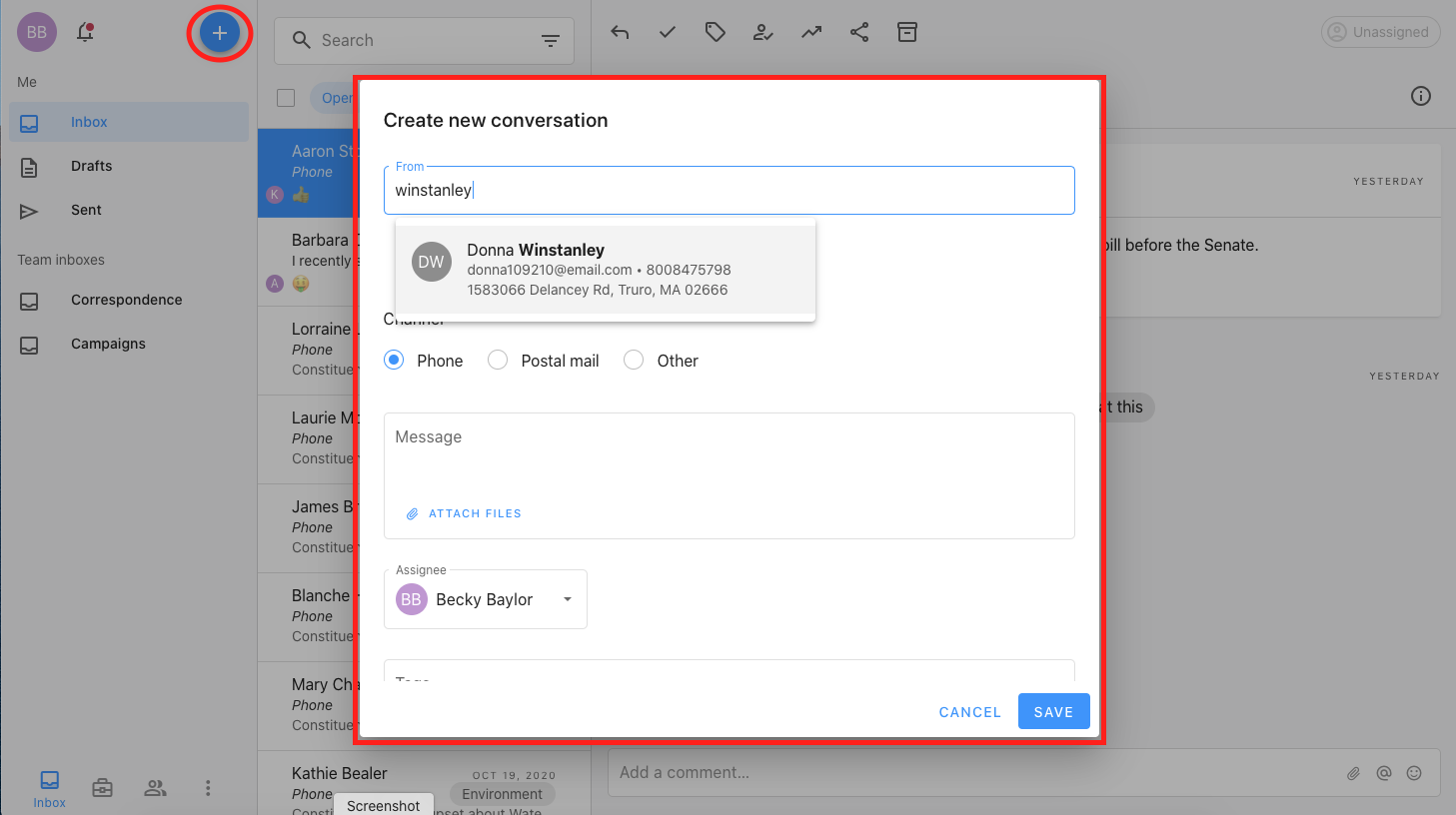
- The "Create new" button is the giant blue "+" in the top left. You'll notice a couple differences here. "Create new message" now reads "Create new conversation." With the introduction of Inbound SMS, the app now supports back and forth conversations for SMS. In the future, we will support back and forth replies for email and include other functionality for richer conversations beyond tracking a single incoming message. You'll also see that many of the "Create new" flows have been reduced to a single step, and auto-complete fields have been optimized to load more quickly and to show more information in the results.
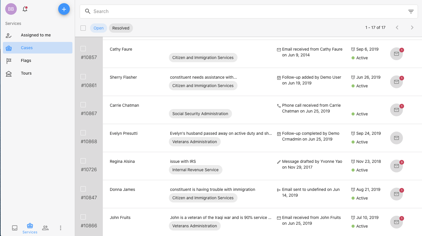
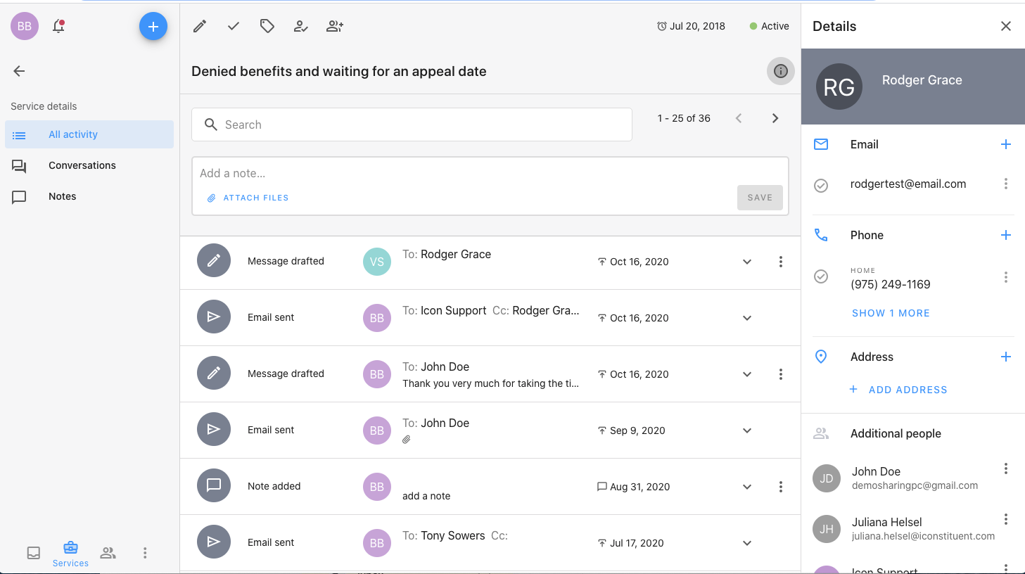
- Navigating the rest of the application is very similar to the Inbox. The main sections of the application are always accessible in the bottom left, the organization of the section you're currently viewing displays on the left, actions are across the top, and side sheets can be opened to filter and to see details. See Services list below with more room to view more service requests, and see an example of a case with the actions across the top and the detail panel on the right.
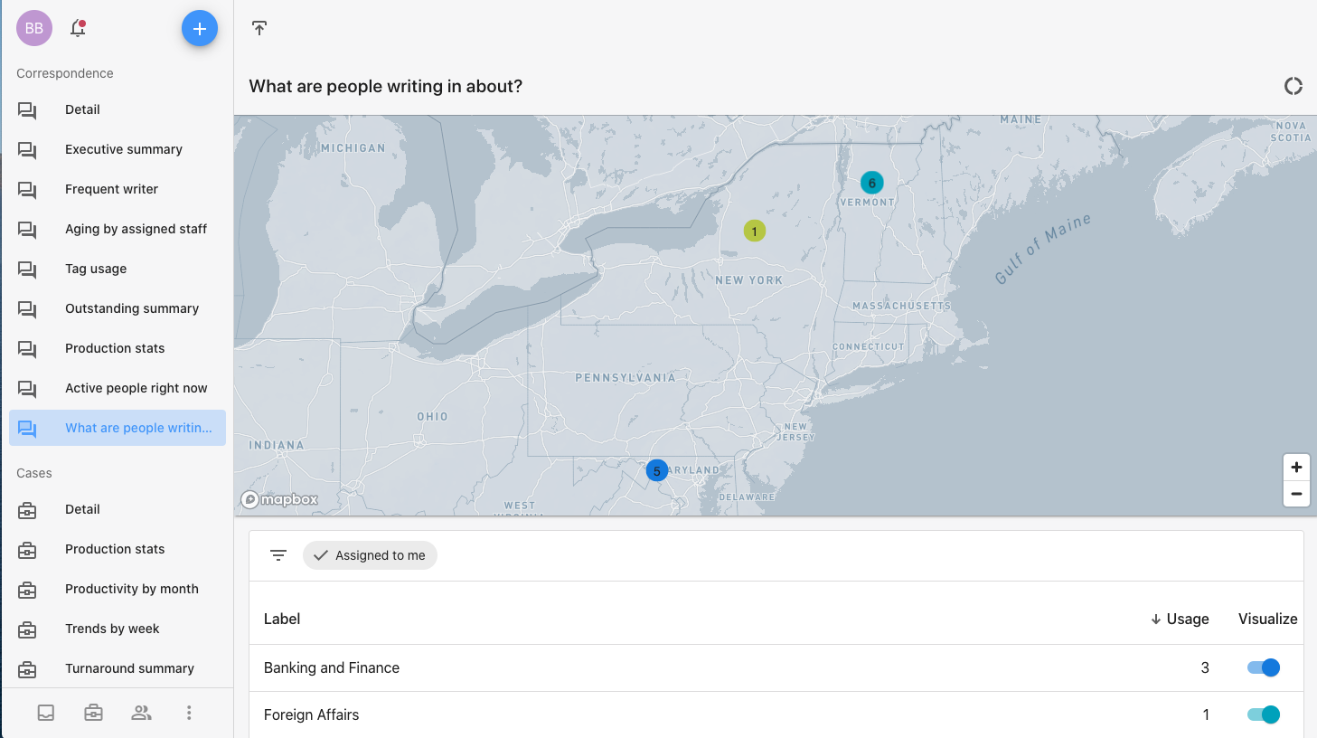
- Both Content library and Reporting have had list improvements. You'll see in Content library that all the letters display as list items rather than cards. You no longer have to page through your letters. Similar to the inbox, you can scroll quickly through your letters and see more of the letter description. In Reporting, the list of reports now displays on the left as navigation elements so you don't have to hop back and forth between the list of reports and the actual reports. See an example of Reporting below:
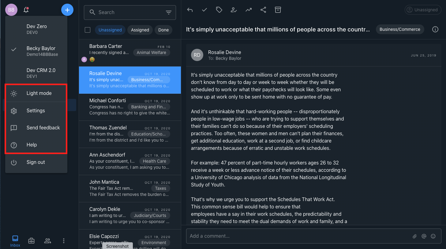
- Settings, Send feedback, and Help are all located under your profile icon in the far top left. You'll also see a new setting for Dark mode. If you work in the application for extended periods of time, dark mode reduces eye strain and improves visibility with low vision. It also looks great! See the menu in light mode and in dark mode below:
Comments
0 comments
Article is closed for comments.